How learning the basics of weather can keep you in the right spots while on passage (published July 2014)
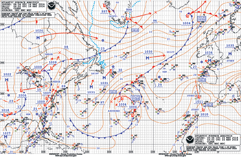
I stood there, facing the seated crowd of sailors and asked, “How many of you have a basic minimum or less understanding of how to read a weather map?” At least 70% of the group raised their hands. It was a typical response. It’s not uncommon for most people—even sailors—to look at a weather map and understand that the “H” represents a high-pressure system and the “L” represents a low-pressure system. But the rest of it just looks like a mass of randomly swirling lines that signify nothing.
“What could it possibly have to do with me or my sailing?” they may have asked themselves at earlier points in their sailing lives. But here they were, committing a day to learn how to decipher the lines and make sense of the squiggles in order to make informed decisions going forward. If the proverb that a picture is worth a thousand words has any truth to it, a weather map has much more importance than that. And it would be up to me, as well as to them, to take eight hours and get to a point at which they could make decisions based on reading those squiggles and numbers and understand some of the subtleties and nuances that exist around the world. The session commenced.
High-pressure systems are typified by cold, dry, sinking air. Low-pressure systems are often associated with warm, moist, rising air. Think about it. Cold air is denser than warm air; it occupies less space per unit volume. If the air is sinking, it’s creating a higher pressure at the surface of the planet. If it’s dry, it has fewer clouds, since clouds are comprised of moisture. Yes, I know that it’s often warm in the middle of a high-pressure system, but that’s because the sun is shining through the cloudless, cool sinking air and warming the surface of the planet.
The relative strength of the high or low can be determined by looking at the three or four digit underlined number under the “H” or “L”. The numbers tell you the center pressure for the system in millibars of pressure. If the center pressure of the low is exceptionally low (i.e. 980 mb) you can think that it will be a strong low-pressure system. Similarly, if the center pressure of the high is very high (i.e. 1040 mb) you can think that it will be a strong high pressure system.
That still doesn’t explain all of those seemingly random swirling lines that surround the highs and the lows. On a surface pressure map, those lines are “isobars”—iso referring to “same” or “equal” and bar referring to barometric pressure. Those lines will tell us how quickly the pressure changes over a horizontal distance. As a quick rule of thumb, the more quickly the pressure changes, the stronger the wind will be in a particular area. Hence, the closer the isobars are together on a surface pressure map, the greater the wind speeds in that area.
Isobars not only imply wind speeds, they also imply wind direction. You may be aware that wind circulates around a Northern Hemisphere high-pressure system in a clockwise direction. The wind circulates around a Northern Hemisphere low-pressure system in a counter-clockwise direction. Essentially, that’s saying the same thing but from a different perspective. Try it. Draw arrows around a high in a clockwise direction and draw arrows around a low in a counter-clockwise direction. You’ll see that the arrows are eventually indicating the same direction along the same set of isobars.
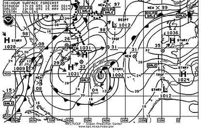 Wind doesn’t travel concentrically along the isobars, though. The wind will tend to want to get away from the high-pressure area and be drawn in toward the low-pressure area. Hence, at the surface of the planet over water, wind around a high-pressure area will toe out from the isobars at about 15 to 20 degrees and toe in towards the low-pressure system by the same amount. Again, it’s saying essentially the same thing, but from a different perspective. If you were to draw arrows around the high in a clockwise direction, overlaid on the isobars, toeing them out from the isobars, away from the high by about 15 degrees, you would have a pretty good idea of what the wind direction is going to be anywhere on that surface pressure weather forecast map.
Of course there are other lines on that weather map. Some of them, indicating frontal boundaries, have little icons located along their length. The ones with triangles represent cold fronts. The ones with semicircles represent warm fronts. The ones with intermittent triangles and semicircles on the same side of the line represent an occluded front, and the ones with alternating triangles and semicircles on alternating sides represent a stationary front. A front of any kind is merely an indication of where two different air masses come in contact with each other. Where there is a cold air mass next to a warm air mass, the front is the boundary layer that exists between the two air masses. Because cold air and warm air have different densities, they will react differently as one tries to push the other out of the way.
Cold air is denser than warm air. When it tries to move towards a warm air mass it’s like a bus trying to move a stack of pillows out of the way. It can do it pretty quickly. So, when a cold front comes through an area, the temperature in that area can change pretty quickly. There is, of course, a relationship between temperature and pressure. As another general rule of thumb, the greater the temperature changes, the greater the pressure changes, and the more wind will result from that pressure change. When you see the cold front line on a weather map, you can visualize the cold air mass behind the front and that cold air mass moving in the direction that the triangles are pointing into the warm air mass.
Warm air is, of course, less dense than cold air. When a warm front is advancing, it happens more slowly. It’s more difficult for that less dense air to displace the more dense cold air. The temperature change often takes place less quickly, typically leading to less wind along a warm front than there would be along a cold front.
Occluded fronts result from cold fronts overrunning warm fronts and the air masses mixing with each other. As those air masses mix, there tends to be less temperature differential and less wind along an occluded front than even along a warm front.
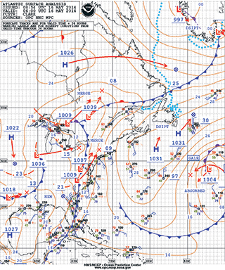 Surface pressure maps will help you to understand where there may be areas of little or no wind as well as where there’s more wind than you want to experience. Areas of little wind can be in the centers of high pressure systems, along ridgelines that might exist between a couple of high pressure areas, and even in the centers of low pressure systems, to mention a few. Older low-pressure systems that have begun to occlude will also have generally less wind in the center than further out on the edges of the system.
Areas of high winds will take place where you have isobars compressed. Perhaps a low-pressure system is moving quickly towards a high-pressure system, and the high isn’t moving out of the way very quickly. The isobars compress, indicating an increase in pressure and thus wind. Young low-pressure systems can also have substantial amounts of wind close to their centers while the temperature differentials between the cold air mass and the warm air mass are at their most extreme.
Happily enough, the Ocean Prediction Center—the folks responsible for creating the weather fax maps you can obtain while offshore—will often put icons indicating when and where a gale or storm may form. Understanding what those lines, “H”, “L” and icons mean, however, will give you a more thorough understanding of why they’re putting those warnings on the weather maps. You won’t need their “Gale” text warning on the map. You’ll have an almost visceral understanding of what’s happening and why. Learning how to read and thoroughly understand weather maps could well be the difference between a comfortable sail or stumbling into a place you really don’t want to be. The difference could be merely a few hours of earnest learning.
Bill Biewenga is a navigator, delivery skipper and weather router. His websites are www.weather4sailors.com and www.WxAdvantage.com. He can be contacted at billbiewenga@cox.net
